Grypmat · 2018
Grypmat
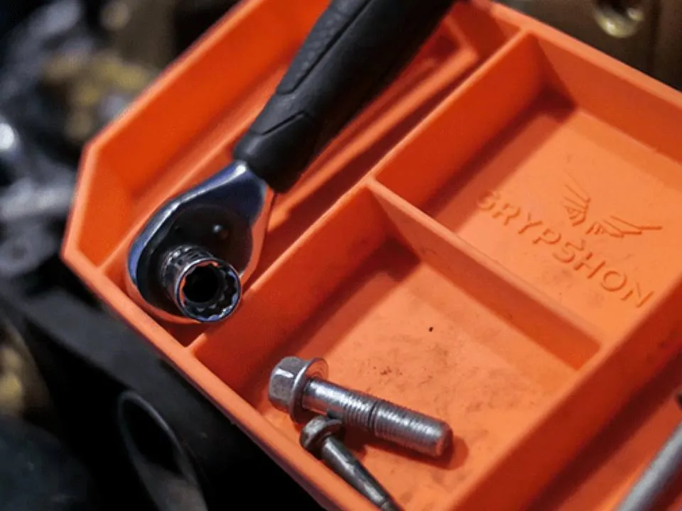
A non-slip tool mat for aviation mechanics, from prototype to Shark Tank to shelf.
- Brand
- Product
- Media
- Directed
I build identity systems that hold up across a package, a shelf, a screen and a campaign, and I draw every piece that hangs off them. Positioning, naming, marks and type systems, through to packaging, print, environmental and campaign typography.
Design the system, not the artifact. Typography carries most of the weight, so it gets decided first and it gets rules.
Output · A positioning line and an audience
What it is, who it is for, and what it is not. Everything visual is downstream of this.
Output · A mark, a type system and a scale
Typography carries most of the weight, so it is decided first and it gets rules.
Output · Guidelines with real applications
Colour, grid, motifs and voice, documented against the surfaces they will actually appear on.
Output · Packaging, print, environment, campaign
The system proved on the hardest surface it has to survive, not on a presentation board.
One attributed recommendation for this practice. Pending content.
Marks, guidelines, type systems, packaging systems
Campaign, print, editorial, apparel, environmental, information design
Applied typography selects pending. Target six to eight pieces across at least four categories.
One piece from this practice expanded with process, so the page is not only a gallery. Pending content.